An initiative to rethink the web-app system design and making it scalable from ground up
Role
Product Designer
Team
CTO, CEO, +Me
Shipped
2023
Overview
German companies can claim refunds for their R&D expenses from the govt. To apply for these refunds, the company has to prove that their R&D project is based on a novel idea, a risk that this idea might fail, and has comprehensive answers to bureaucratic questions.
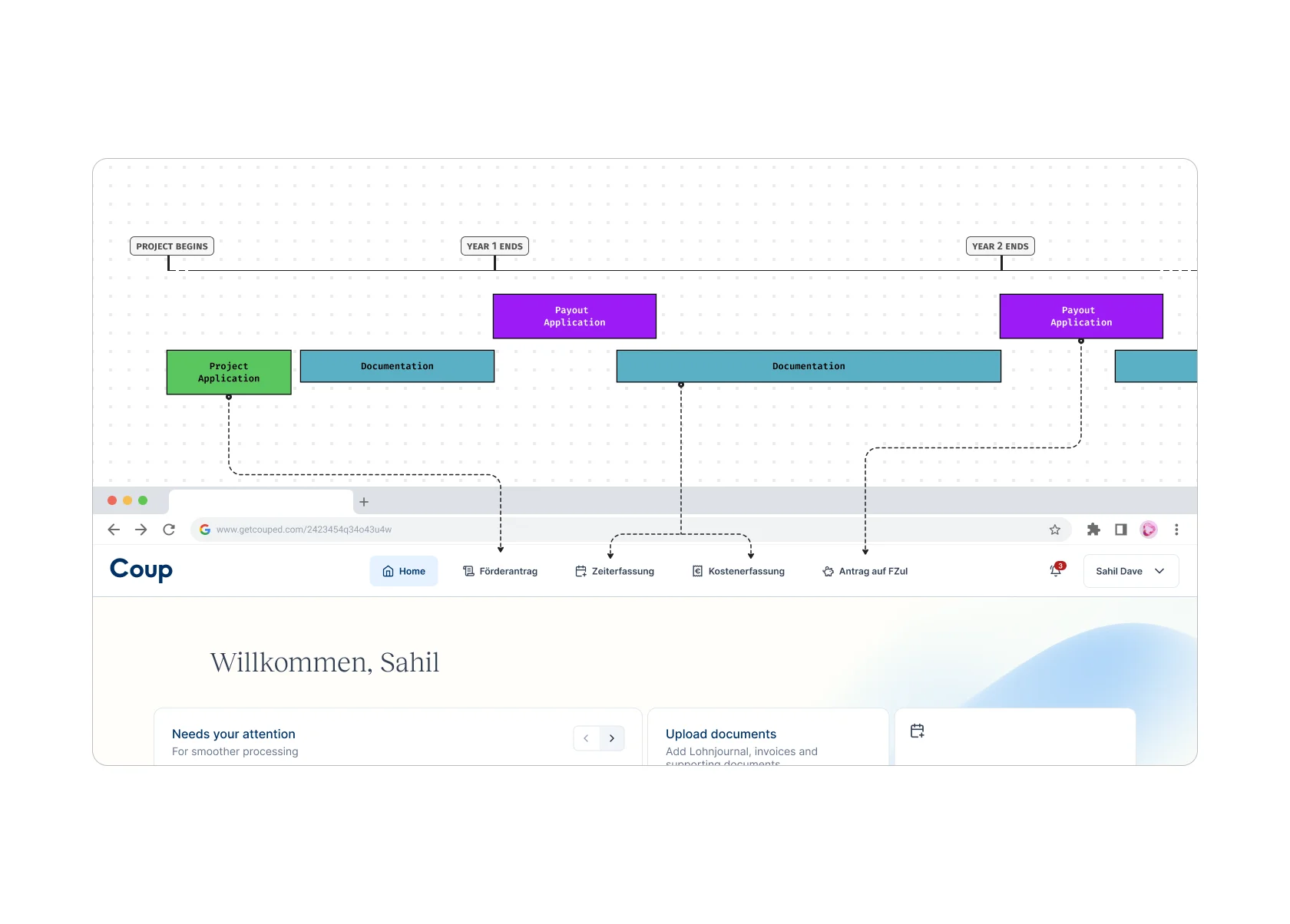
The R&D Application is the first step. If approved by the govt office, the company becomes Coup's client. Henceforth, the client has to track their employee's time spent on R&D, document external contractor's invoices, contracts & receipts, for the whole span of the project duration. A project on average lasted 2-3 years. Eventually, a final application similar to a tax-refund is created which collates all the previously uploaded data over the project duration.
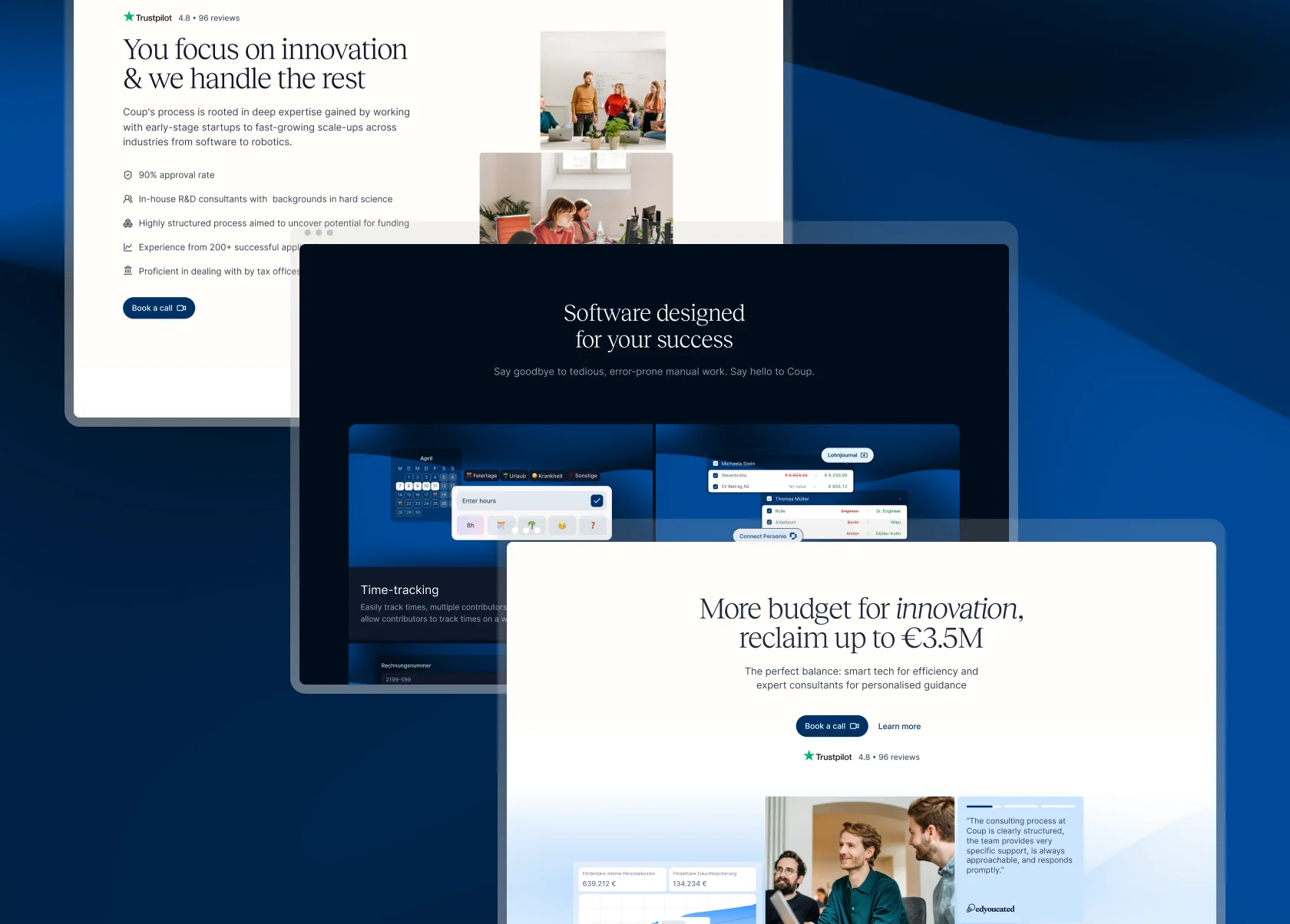
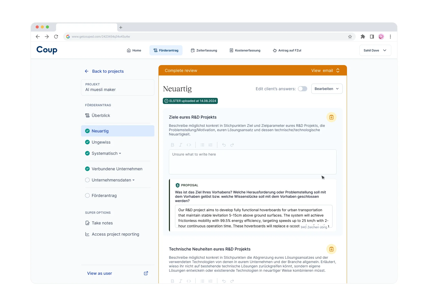
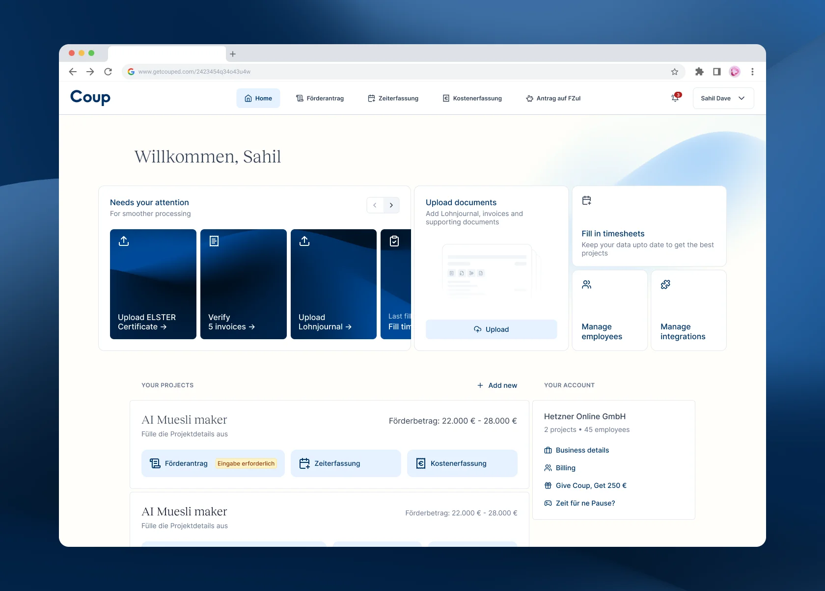
Coup's new web-app
Comparison between the old and the new layout of the same screen
Situation
While designing Client-Consultant chat system, I discovered that the existing design of the web-app was not scalable. The Coup web-app had grown organically based on user requirements, however, without a product designer.
As an initiative, I audited the web-app and identified how to plug the holes in the information architecture. It needed an overhaul. The Co-founders resonated with the problem at hand.
Constraints
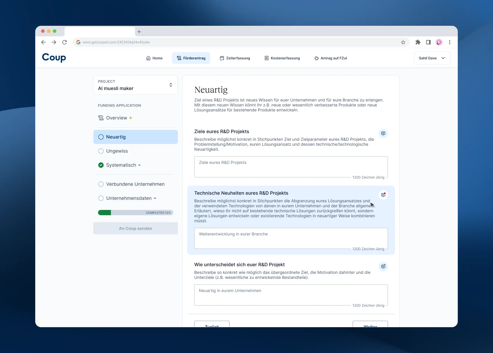
Overloaded application architecture
Overloaded UI for clients & consultants: The coup web-app has two users - the client, and the internal super users called Consultants. The latter have extra UI blocks only visible to them overloading the user UI. Moreover, the consultants frequently need to visit the "User UI" while helping out the clients via screenshare.
Complex data model
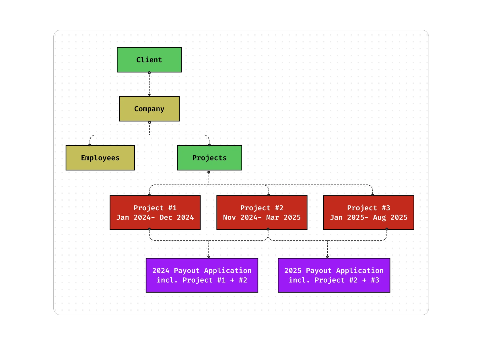
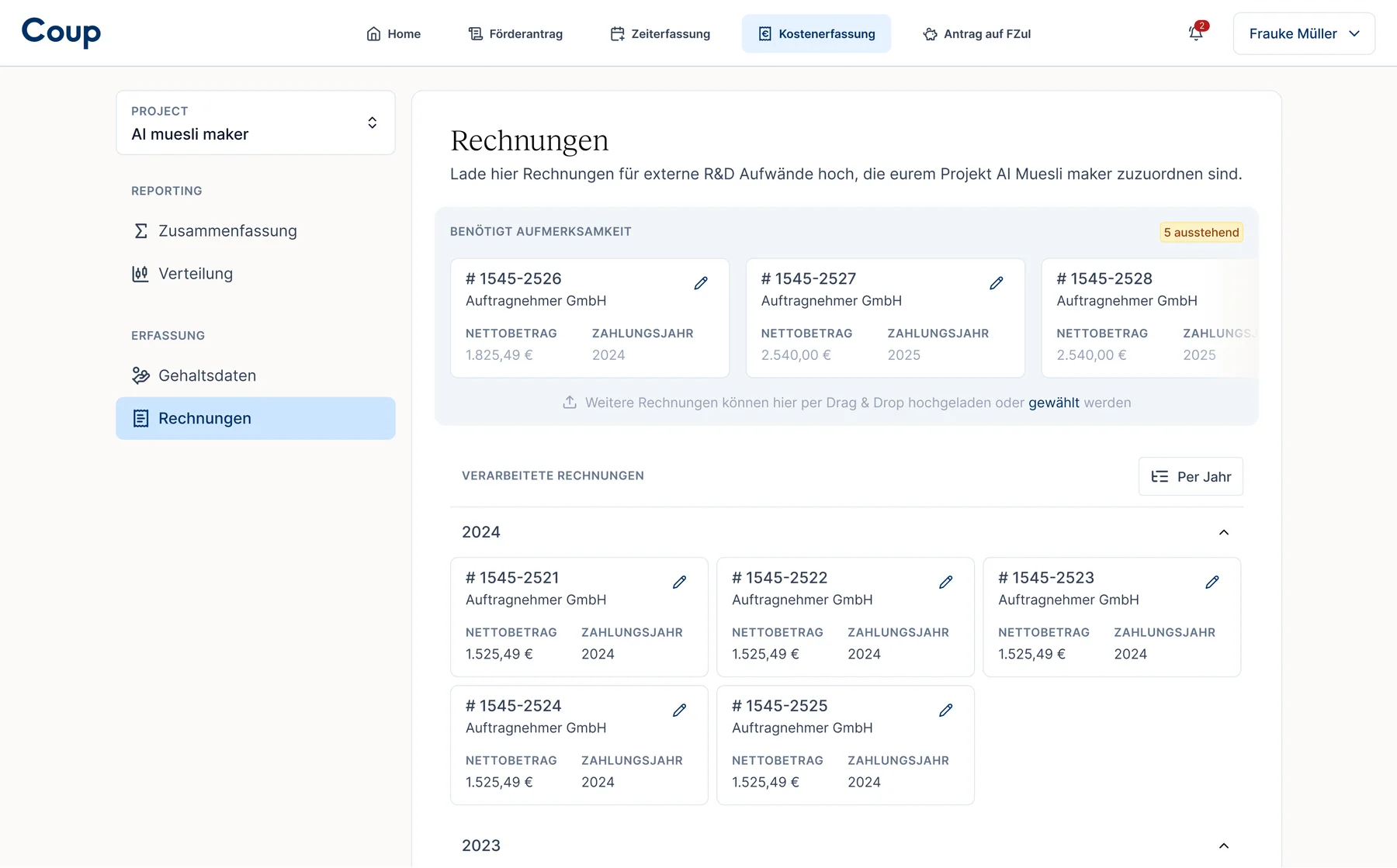
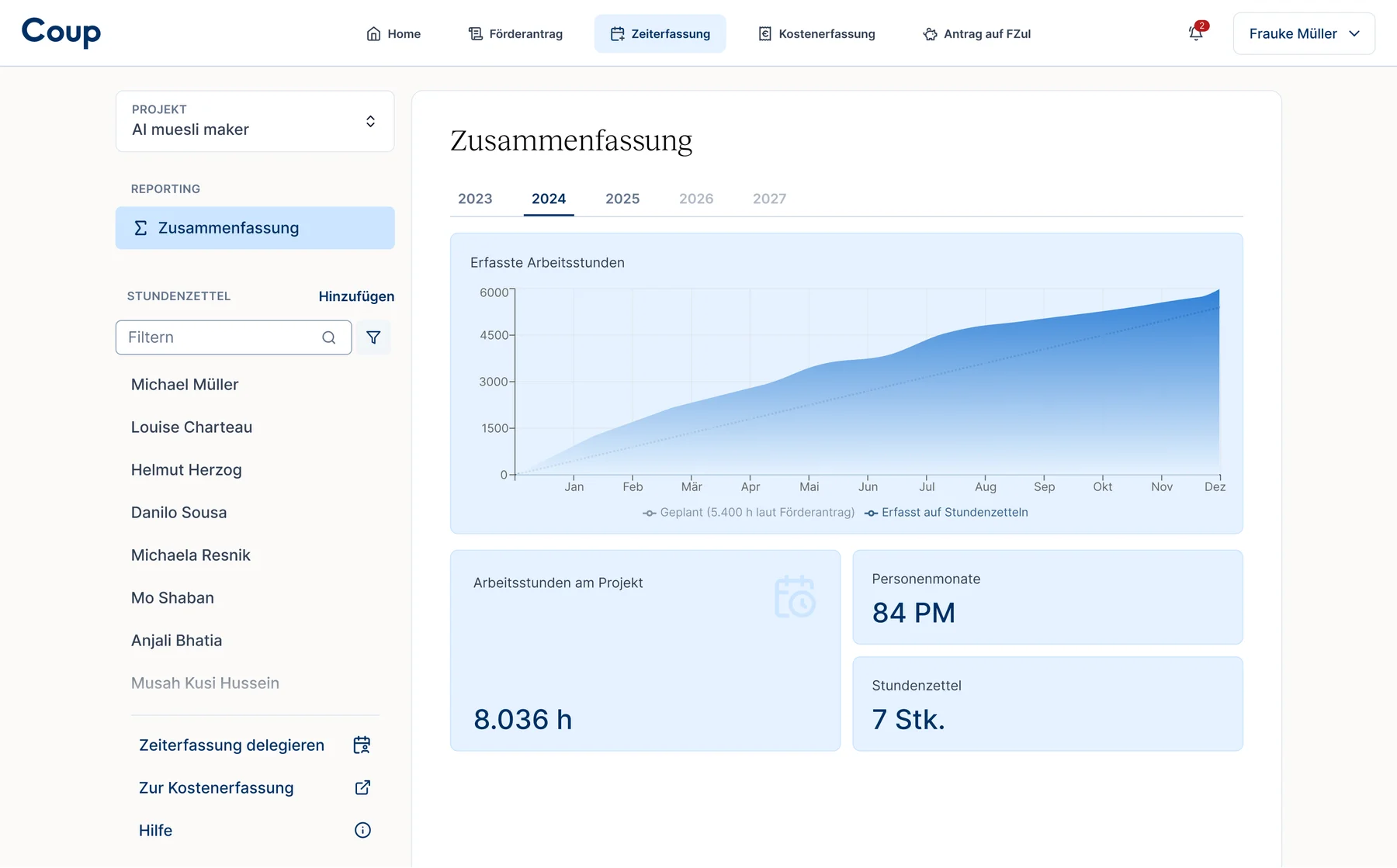
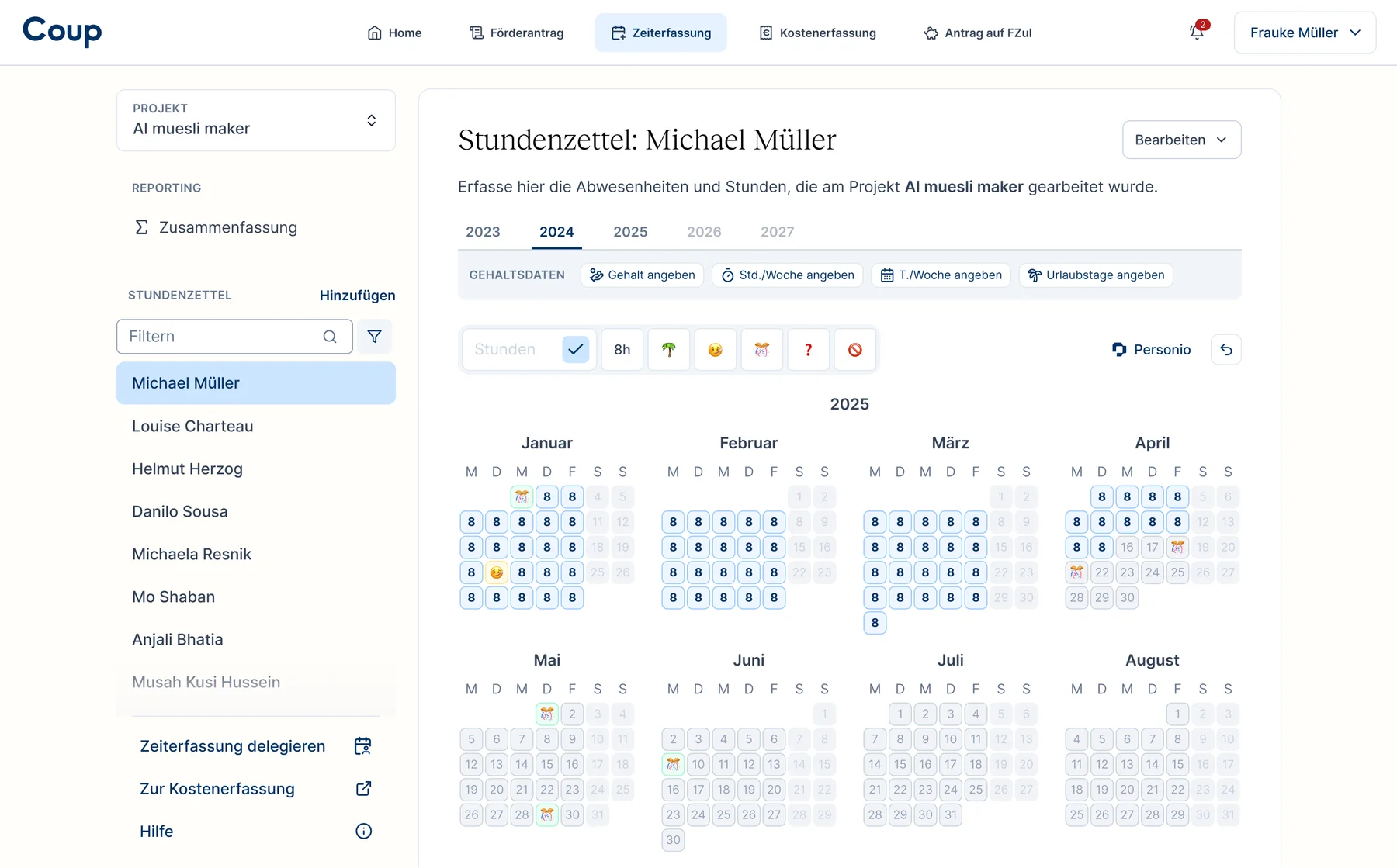
The user documents their R&D employee's data on a project-to-project basis, over the span of the project. For eg if John Doe works on two R&D project, their timesheet has to be filled separately for both the projects, reflecting the actual time spent on individual project. Eventually when getting the funding, the data across all the projects is collated into one application.
Overloaded UI between client and consultant
Opportunities
Bring client's journey to forefront
Clearly mapping out what the client does and at what stage of their project brought the team at the same understanding, easing the decision making. And more often than not, the client works only in one phase of the journey.
One screen for one type of action
Getting a dedicated page to each action benefits both, the user and the product team. The former by giving them a focussed space to work in and reducing cognitive load. And the latter by making the screens more scalable for future updates.
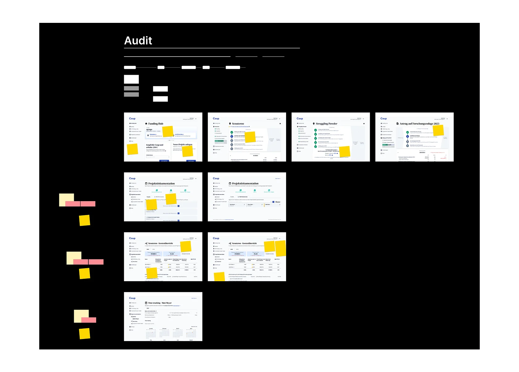
Redacted screenshots of the audits and product explorations
Solutions
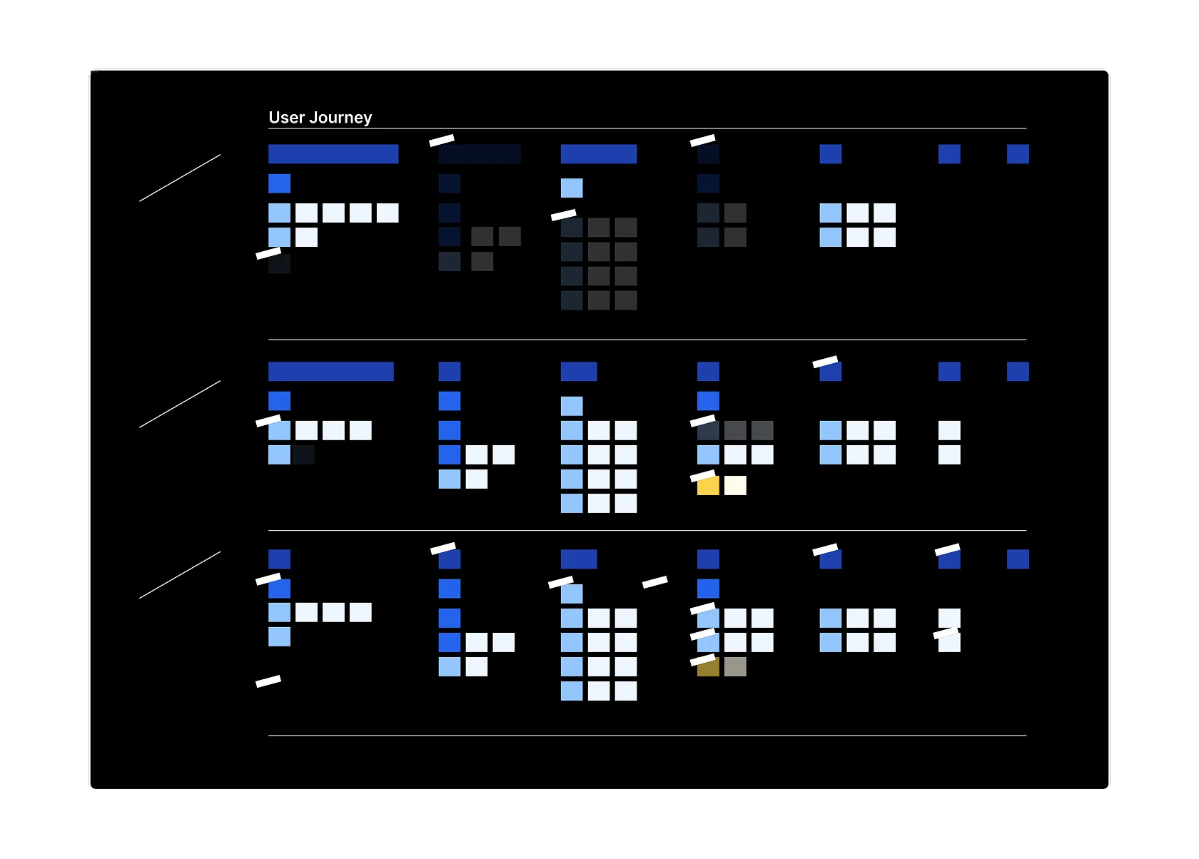
Follow client's journey
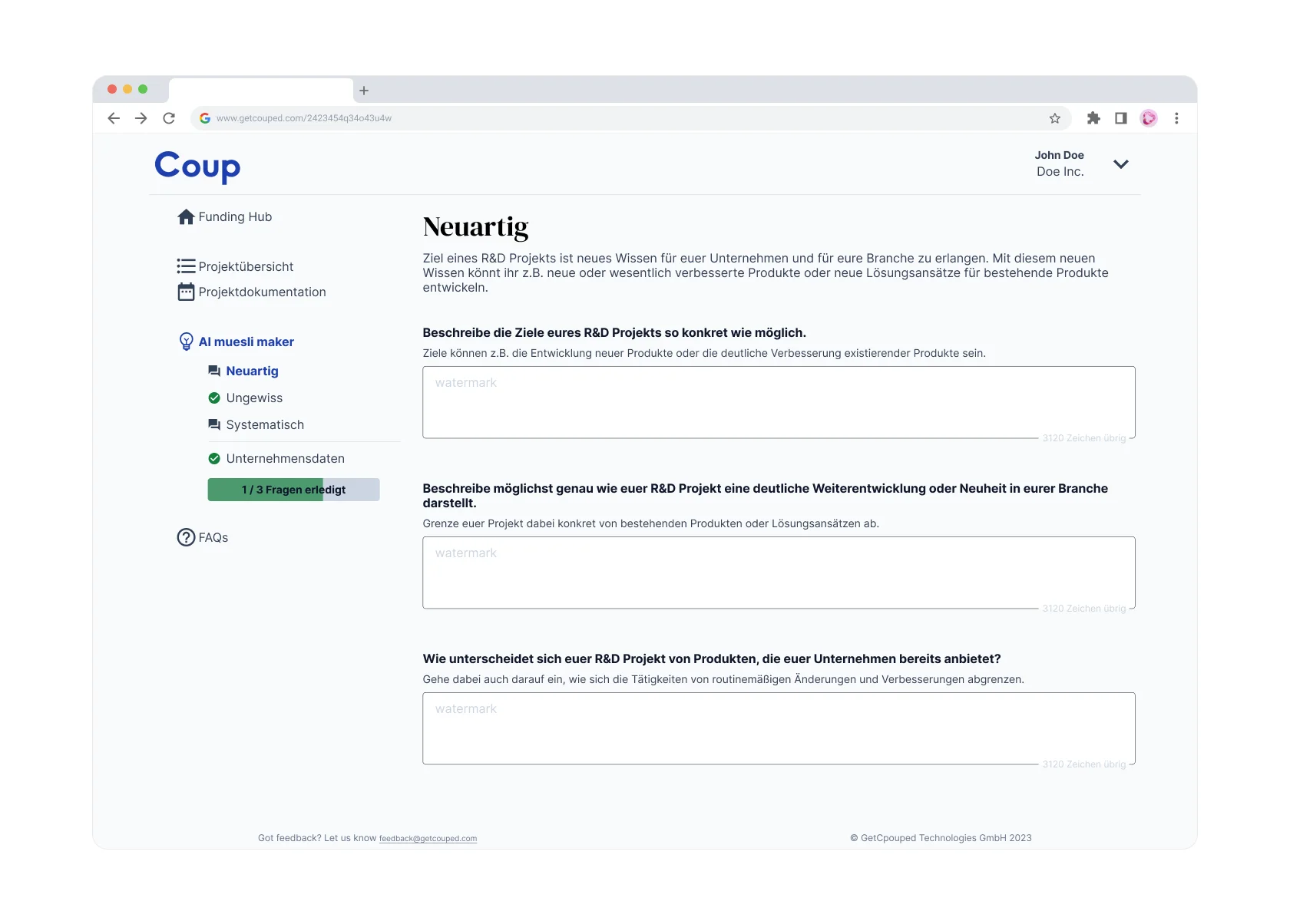
After a few iterations, we decided to make the UI navigation follow the client's journey through their project duration. Generally speaking, this meant that the client would log-in and go straight to one tab depending on the phase of their project.
Another advantage was the scalability. Adding or splitting a tab is easier depending upon if a feature gains prominence. In 2025, a new documentation tab called "Cost tracking" was added when a need of user uploaded invoices & receipts surfaced.
The app now has a hierarchical for client's journey and data
Dedicated place for hierarchical data
With complex hierarchy of a data model there is always a challenge of user unable to find where their data is housed. Imagine looking around all over the app trying to figure out the place to update your company's address. With this update, having a cleaned up hierarchy was one of the biggest needs.
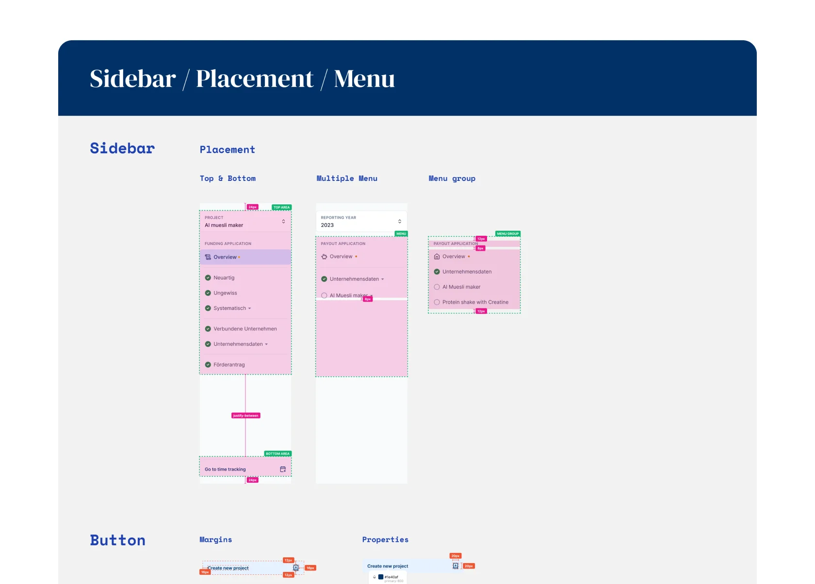
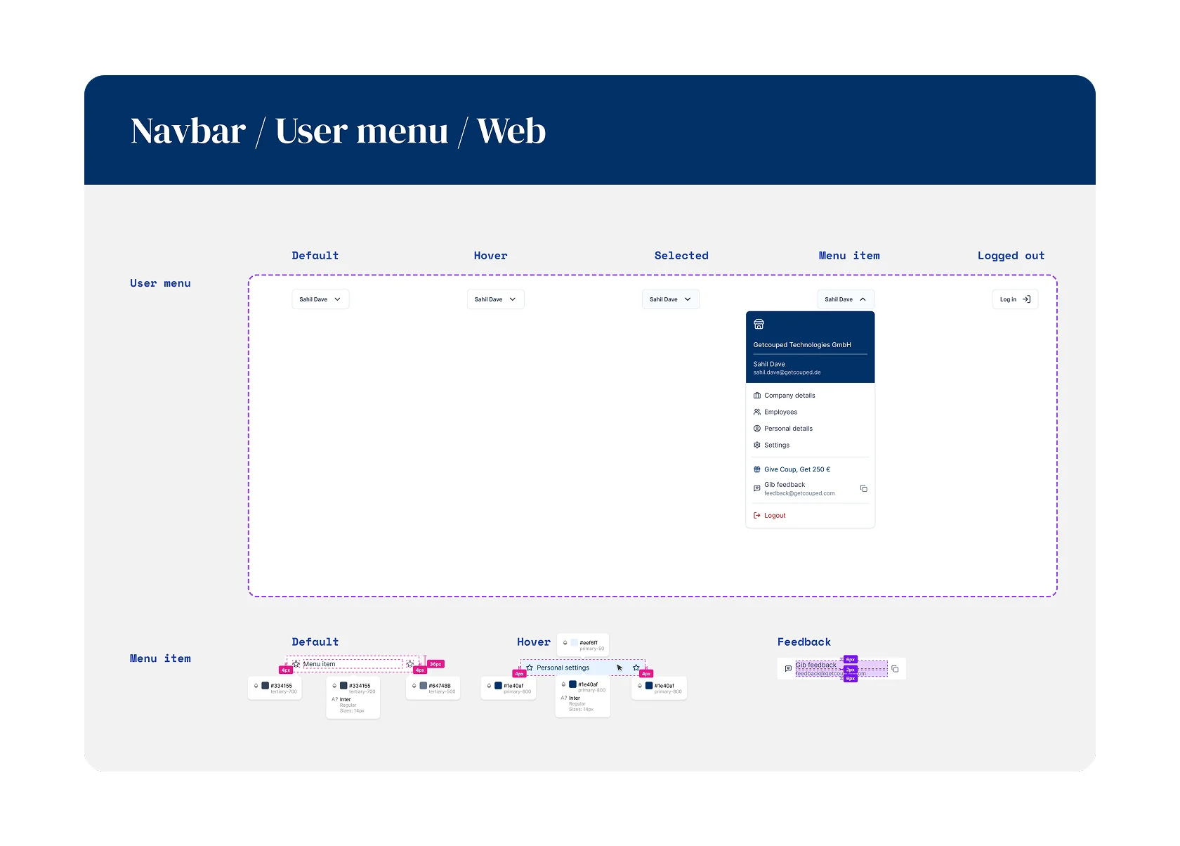
Review sidebar components, and final review mode
Design Handoff
Since I was working as a part-time freelancer, I needed to make sure there is no blocker in design handoffs. The devs, Erik (CTO) and Alistair (Senior Dev), are very design savvy and found it easy to understand the handoff material and extrapolate if needed.
In the very end of the beta state, I jumped into the codebase to fix any and all UI problem using my dev chops.
Design handoff screens
Post-launch
The web-app update was well received by the clients and consultants (power users) alike. To this day, the app structure has been robust enough to face the needs of any new feature in a fast growing product.
Follow-up
Before embarking on my year-long world tour, one of the last initiative was to clean up the "Home" tab of the web-app. I brought in the branded elements from the newly designed website, and added a few more features that we've been longing to add for 2 years.